Once again, I was able to create my templates and final products with the windows application indesign. The planning of my table of contents was over the course of roughly 2 months. I included my brainstorm for my table of contents, to further elaborate on the meaning I wanted to create for my magazine.
The design of my table of contents was simple and straight to the point. I wanted to avoid a convoluted formatting for my table of contents because I find extra information unnecessary and too distracting for readers. Moreover, my target audience are fellow adventurous travelers, and from my personal experience these types of travelers aren't ones to over analyze magazines. They just want it short and sweet so they can move onto their next endeavor!
So I made my table of contents straight to the point and made sure to focus the attention on the photos featured rather than the text. My general focus throughout my creative process was on the photos to portray the beautiful landscapes rather than having text tell readers how to feel about the landscapes. I wanted to create appreciation for the beauty of nature through these scenic photos.
At first getting the positioning of the photos perfect was a challenge because of the different sizes and content. However, I was able to find the perfect fit for the photos so that the beauty of one didn't distract from the other.

As for the text, I was juggling between san serif and sarif fonts but then realized that in order to maintain the house style, I had to use similar text fonts or incorporate the same ones. For the title of the different categories (table of contents) and "Table of Contents" I used the same font for the title of the articles in my feature spread. This created similarity in the style of the different parts of the magazine (part of my house style). For the article titles I used a simple font to incorporate a form of uniform in my magazine (also included this in my feature spread with the uniform text columns).

The design of my table of contents was simple and straight to the point. I wanted to avoid a convoluted formatting for my table of contents because I find extra information unnecessary and too distracting for readers. Moreover, my target audience are fellow adventurous travelers, and from my personal experience these types of travelers aren't ones to over analyze magazines. They just want it short and sweet so they can move onto their next endeavor!
So I made my table of contents straight to the point and made sure to focus the attention on the photos featured rather than the text. My general focus throughout my creative process was on the photos to portray the beautiful landscapes rather than having text tell readers how to feel about the landscapes. I wanted to create appreciation for the beauty of nature through these scenic photos.
At first getting the positioning of the photos perfect was a challenge because of the different sizes and content. However, I was able to find the perfect fit for the photos so that the beauty of one didn't distract from the other.
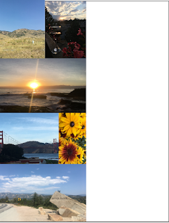
Playing around with positioning:
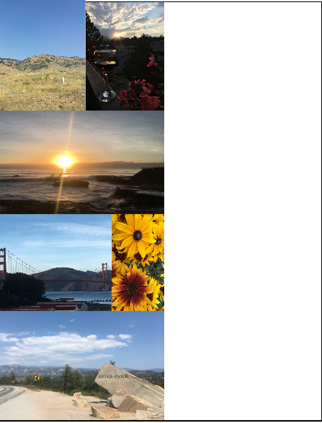
Final format (photos):
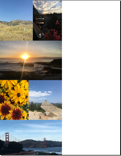
Below I included my final draft.

Comments
Post a Comment