The table of contents for "Place To Escape" was my last edition to the magazine's creation. With my front cover and my spread I implemented a simple house style, I also continued this theme onto table of contents.
In order to catch my audiences attention I needed to have titles for my articles that allured readers to flipping onto the article page. In order to achieve this I searched for tips on creating successful article titles. As a result, I was able to put together titles for articles featured in "Place to Escape." Including:
Enter the Golden Gates
Longs peak
Bolder, Colorado? Or Boulder, Colorado?
Surfing Paradise
Forest Kings
El Capitan
The Rockies Kingdom
Trek of a lifetime
Biking and Hiking? Let's do it
City of the Stars
I drew inspiration from magazines that had a simple one page table of content spread and included photos in about half of the spread.
I used this concept in my feature spread, with half of the page having photos and the other half with text. Therefore, I found implementing this formatting for the table of contents most logical in order to continue my house style.
In order to fit my house style; however, I created a collage rather than the organized format featured in the magazines below. I also included this detail in my feature spread.


I typically saw about 10 articles for the travel magazine table of contents that I encountered in my research. The amount of pages ranged anywhere from 60 to 70 pages. I also followed this format and incorporated about the same amount of pages.
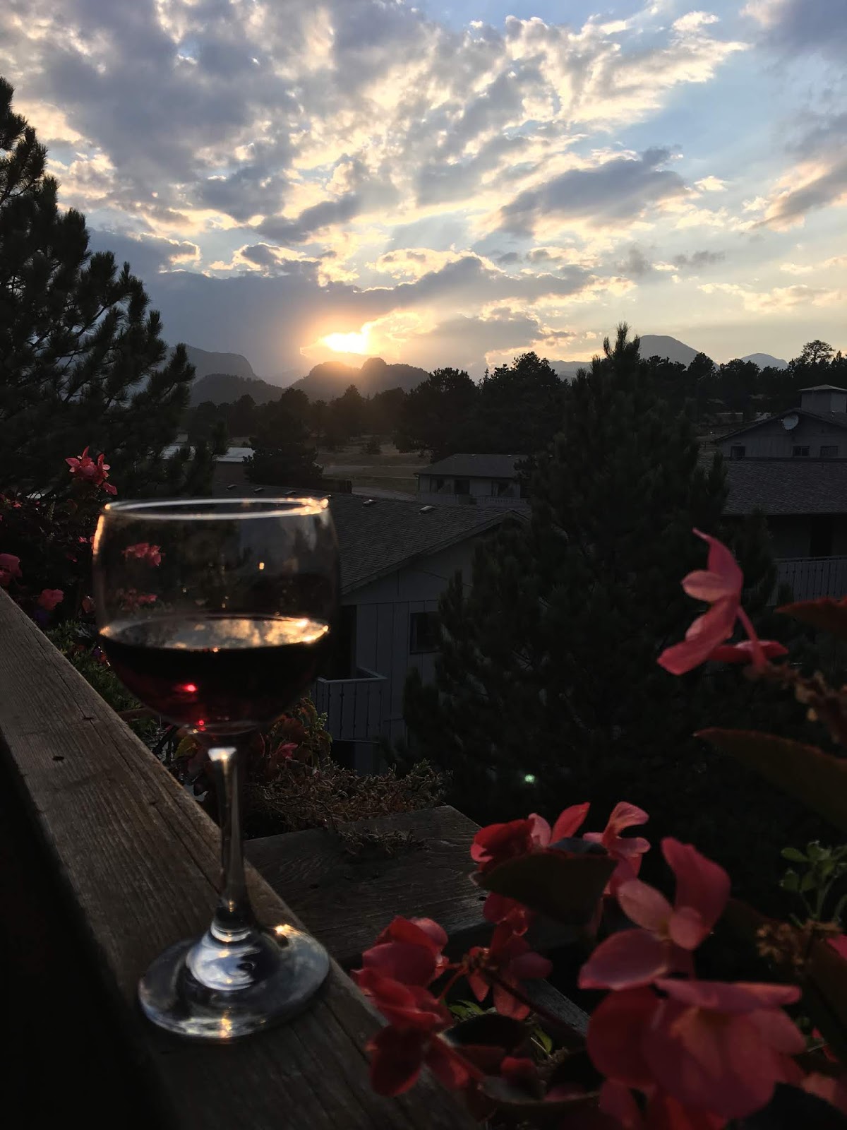
For my photo selection I choose different types of photos in order to portray the beauty of Colorado and California. Once again, I took these photos on my winter trip, you can refer to my photo shoot planning blog post for more information. With each state their were different landscape types. Therefore, I made sure to incorporate this into my table of contents because I feel the table of contents as a whole summarizes the magazine content and represents it, making it essential to show the diversity of the content with the photos. I selected 3 Colorado photos and 3 California photos.


In order to catch my audiences attention I needed to have titles for my articles that allured readers to flipping onto the article page. In order to achieve this I searched for tips on creating successful article titles. As a result, I was able to put together titles for articles featured in "Place to Escape." Including:
Enter the Golden Gates
Longs peak
Bolder, Colorado? Or Boulder, Colorado?
Surfing Paradise
Forest Kings
El Capitan
The Rockies Kingdom
Trek of a lifetime
Biking and Hiking? Let's do it
City of the Stars
I drew inspiration from magazines that had a simple one page table of content spread and included photos in about half of the spread.
I used this concept in my feature spread, with half of the page having photos and the other half with text. Therefore, I found implementing this formatting for the table of contents most logical in order to continue my house style.
In order to fit my house style; however, I created a collage rather than the organized format featured in the magazines below. I also included this detail in my feature spread.


I typically saw about 10 articles for the travel magazine table of contents that I encountered in my research. The amount of pages ranged anywhere from 60 to 70 pages. I also followed this format and incorporated about the same amount of pages.
For my photo selection I choose different types of photos in order to portray the beauty of Colorado and California. Once again, I took these photos on my winter trip, you can refer to my photo shoot planning blog post for more information. With each state their were different landscape types. Therefore, I made sure to incorporate this into my table of contents because I feel the table of contents as a whole summarizes the magazine content and represents it, making it essential to show the diversity of the content with the photos. I selected 3 Colorado photos and 3 California photos.
Colorado:


California:


As you can tell, when comparing my photos to the photos featured in my table of contents, I did not use photo enhancement. I felt that the photos did not need enhancement because I was lucky enough to have great lighting when I shoot the photos.
Comments
Post a Comment