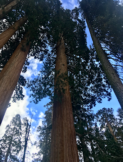
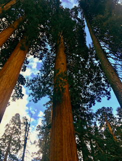
For my magazine I enhanced the lighting of my featured photo so that the bark and canopy of the tree is more detailed and visible. I also added a red tint on photo shop in order to enhance the color of the red woods' bark. The location of this photo was in Sequoia National park. I choose this location because it is one of California's national parks, I deemed this appropriate because my target audience is adventurous travelers and nature goers.
When I took the photo of the towering trees, I decided on a high angle shot in order to grasp the height them. The viewer then feels how nature prevails the power of humans as it towers above and continues to do so for more hundreds of years. The high angle creates a sense of superiority, which I felt and wanted to replicate in the shot. Furthermore, I decided on a close up shot of the canopies to rely how close humans actually are to nature. We tend to view nature as something strange and unknown, fearing how vulnerable we are to it because of our lack of control. But as a part of nature and its cycle, we have to be accepting of our vulnerability to the vastness of it. This message is what inspired me to take a close up shot rather than a full shot, as well as the high angle.
When choosing what photo to include I was contemplating between two photos that I shot in the park. The first photo was the contrast of a dead, lying red wood with fallen snow on it and a live and upright sequoia. The second photo, being the one I included on my cover, was a high angle shot of a family of redwoods. The canopies of the sequoias are visible. The blue sky contrasts with the red bark and allows for the red wood to pop.I felt that this photo enraptured the vastness of nature with the trees juxtaposing the vastness of the sky, which is why I choose this as my featured photo for my front cover.
The high angle shot emphasizes the power and beauty of nature and its creations. Nature is viewed as intimating and while it is, as it towers above us, we are still part of natures creation and growing daily. I wanted to create a magazine appreciating the beauty of nature and I feel that this photograph of the redwoods bodies this message.
I decided to keep the magazine title "Place to Escape" throughout my editing process because it embodies my message to readers. I want readers to view nature as something beautiful and viewing it as a "place to escape" from life's routines. Also, during my research of travel magazines I noticed the constant feature of the word "travel." While my magazine is a travel magazine, I feel that the use of travel in the title is sterile. The word escape implies a more fantasy-like experience with nature and its beauty, creating intimacy between readers and nature.
When I took the photo of the towering trees, I decided on a high angle shot in order to grasp the height them. The viewer then feels how nature prevails the power of humans as it towers above and continues to do so for more hundreds of years. The high angle creates a sense of superiority, which I felt and wanted to replicate in the shot. Furthermore, I decided on a close up shot of the canopies to rely how close humans actually are to nature. We tend to view nature as something strange and unknown, fearing how vulnerable we are to it because of our lack of control. But as a part of nature and its cycle, we have to be accepting of our vulnerability to the vastness of it. This message is what inspired me to take a close up shot rather than a full shot, as well as the high angle.
The high angle shot emphasizes the power and beauty of nature and its creations. Nature is viewed as intimating and while it is, as it towers above us, we are still part of natures creation and growing daily. I wanted to create a magazine appreciating the beauty of nature and I feel that this photograph of the redwoods bodies this message.
I decided to keep the magazine title "Place to Escape" throughout my editing process because it embodies my message to readers. I want readers to view nature as something beautiful and viewing it as a "place to escape" from life's routines. Also, during my research of travel magazines I noticed the constant feature of the word "travel." While my magazine is a travel magazine, I feel that the use of travel in the title is sterile. The word escape implies a more fantasy-like experience with nature and its beauty, creating intimacy between readers and nature.


Comments
Post a Comment