
PTS magazine front cover brainstorm

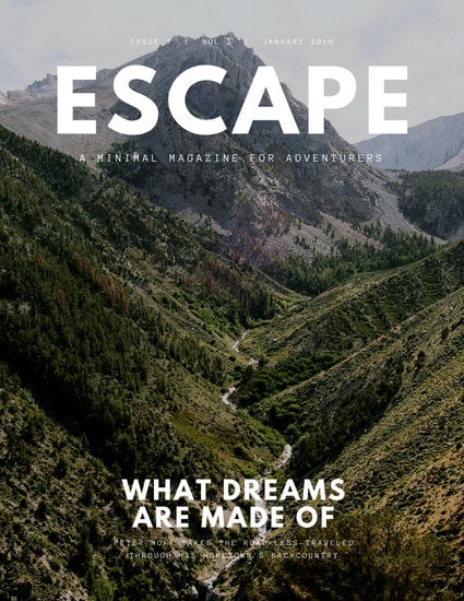
This magazine will be a travel magazine, for the purpose of showcasing natures beauty. For my magazine I decided that a simple front cover is most appropriate for the image I want to portray in my magazine: the beauty of travel, specifically the scenery displayed. I drew inspiration from several magazine covers:


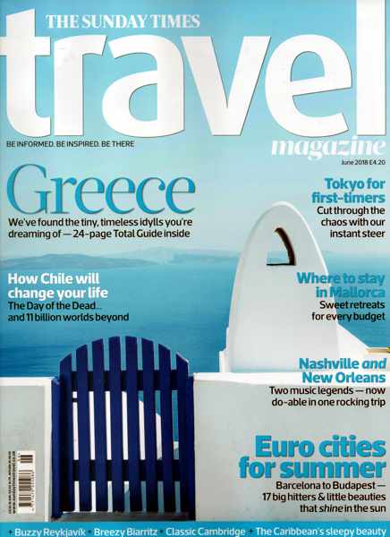
The title of the magazines are written in san serif font. I find this look more appealing for my focus being on the beauty of the photos portrayed in the cover photo. The simple text will serve as a compliment to the photo rather than a distraction. As for the color of the text I envision a creamy white or and off-white, so that while complimenting the front cover photo, the title is still simple and classic. 

 I intend on using cool tone colors for the photo featured on the front page. The use of col tones creates a homely and mysterious feel to the photography, this embodies the human perspective on nature. As it being a mysterious and intimidating force. I want to be able to recreate this feeling of nature and expose to readers how beautifully mysterious nature is.  

The 3rd magazine cover I included the one I am most inspired by. There is minimal text on the cover, and the text location is determined by the landscape of the photograph. The text included is in the base of the photograph and the top of it. This helps to create continuity between the middle portion of the photograph, rather than having text interrupt the natural continuity of the eyes as they glance over the cover of the photo. The use of this technique creates a smooth and easy read for readers of my magazine. 

Comments

Popular posts from this blog

I represent "Place To Escape" magazine

5280 Magazine Analysis

     The issue of the 5082 is a scenic travel magazine that portrays Colorado's extravagant views. Various techniques are utilized on the front cover of this magazine. For starters, the background photo consistently shows mountainous shots. The shots show grassy or rocky terrain and mountains as the backdrop. Two of the three covers show a person in the shot. This can possibly allude to readers as they feel it is a welcoming site instead of an intimidating terrain , given that others have explored the same views portrayed in these shots. The shots are taken either at dawn or dusk, this may be because the sunset/sunrise highlight the beauty of the views (hues of color) and hikers tend to be early birds, making readers want to be present at the time; also, making the possible target: adventurous travelers and nature's admirers.       Furthermore, the colors in the magazine help to create a placid mood and a welcoming feeling. All the ed...

PTS feature spread creative process

For the creation of my feature spread I, first wanted to include a spread with only one article throughout the two page spread and was torn between a Colorado or California article. However, I then realized that I was replicating the format of several travel spreads I had researched and failed to put my own spin to it. As a result, I brainstormed the format of two separate mini articles on my two page spread (previous brainstorming mentioned in blog post "PTS spread and table of contents brainstorm layout" went into the construction of this formatting below) :   The photos about each article will be in relation to the article below it. Therefore making each page separate articles, on the nature spot I deemed suiting for Colorado and the other for California.   For the photos featured above the articles, I had taken panoramic shots and I wanted to include one in the spread. Specifically for Yosemite because of the blue hues and purple hues that I was able to cap...